Vintents rebrand

Projects*

Projects*

Projects*
Vintents are a luxury vintage glamping comany that provide services for the likes of glastonbury festival, shambala, and many more UK festivals.
They are currently focusing on growing their business within the weddings and croperate events industry
Services
Graphic design,
website consultancy
Visual & Brand Identity
Client
Vintents LTD
Year
2023-
present
The Vintents team wanted to update their branding to compete within an ever-growing market for glamping and outdoor recreation in the UK and overseas. It was important from the beginning that the new branding suggested a vintage-modern feel that reflected the companies' product whilst adhering to contemporary design trends. The Vintents range of 60s, 70s and 80s canvas tents form an impressive sight (or should that be ‘site’), and it’s their uniquely colourful setup that distinguishes Vintents from the rather plain bell tents offered by their competitors in the ‘field’ that experienced glampers will be accustomed to.
For Vintents, the branding needed to express this. So, instead of heading straight down a 'fancy glamping' route for the branding – a Smörgåsbord of very plain outlines of yurts and whimsical serif typefaces – it felt right to lean into the 'adventure' style branding you'd expect to see on the fleeces and rucksacks of popular outdoor equipment/clothing brands. Given Vintents' popularity on the festival circuit, this has opened them up to a new avenue of merchandise sales along with a visual identity that feels familiar to people – beyond the glamping community.


Testimonial &
reference details
"Joe has been an absolute asset to our company over the last few months, completely refreshing our branding and marketing content, including two new logos. He is incredibly versatile and full of ideas. We couldn't be happier with how it's turned out and will continue to work with Joe for ongoing design and marketing projects."
Harry Collett, VIntents LTD
for references via phone call please get in touch with Joe* for contact details
Salvage Cafe rebrand
Salvage Cafe is a well-loved destination for food and drink in the heart of Hove, East Sussex. The popularity of the cafe comes from it's bustilng and curious interior, in which everything (apart from the Vinyl) is for sale.
Services
Graphic design,
Menu Consultancy,
Visual & Brand Identity
Client
Salvage Cafe
Year
2022-
present


Brighton (and Hove) is the coffee capital of the UK, with over 360 registered cafes and coffee shops (the equivalent of one coffee shop for every 800 people). So, for a business to survive and prosper in this crowded marketplace, standing out is pivotal to survival, particularly in the context of a cost-of-living crisis. Like many small businesses, Salvage has been forced to raise prices in order to stay afloat. However, when the market is so saturated with cafes and restaurants, prices need to be reflected within the quality of the product. This cannot be achieved through the product alone, it needs to be packaged in such a way the consumer can have confidence in its quality.
In a high street that is full of cafes with either minimalistic design or 'boujie' interiors, Salvage's warm and worn apothecary aesthetic needed to be celebrated.
Through getting to know Taz, his vision and his passion, I was able put together a brand identity that reflected not only the character of the cafe but also the ethos of its owner. The Salvage eye, with its vinyl record iris has become a widely recognised representation of the cafe, and is used on its packaging, social media content and merchandise.
With several years’ experience as a Chef, I also played a key role in curating the food menu for the cafe, putting together dishes that adhere to current food trends, and thereby further increasing the popularity of the cafe.
Testimonial &
reference details
"Joe has been fantastic to work with over the last year. Everything he has done for the Cafe has always had the heart and soul place in mind. He's always worked within the realms of possibility for a small business, whilst elavating our branding and our concept. The place has been given a marketable identity without losing a bit of its personality which has had a great effect on business. We've been able to increase our prices across the board which has been essential during a cost of living crisis. Thanks Joe"
Tazz Kahn, Salvage Cafe
for references via phone call please get in touch with Joe* for contact details
Nature Kitchen rebrand
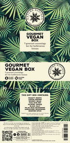
Nature Kitchen is a familly run spice merchants based in Cornwall, running since 2009. With over 180 products including 60 of their own unique spice blends, Nature Kitchen sell products internationally both online and in stores.
Services
Graphic design,
Web design,
Visual & Brand Identity
Client
Nature Kitchen Co LTD
Year
2020-2023


Prior to my involvement with Nature Kitchen, no work had been done on the branding of their products for over a decade. As a family run business, so much time was taken up by administrative tasks and the packaging and branding of the product itself was left behind as other parts of the company evolved. With the advent of the pandemic, and the resulting spike in online shopping, a host of new competitors entered the market. It immediately became clear that the visual identity of the company and its products needed a major up-date in order to compete.
Along with the redesign of the company logo, my work included a whole redesign of their 14 gift boxes and their inserts, a restructuring of how products were visually categorised using a new set of brand colours, up to date copy that reflected the character of the business and a new look for the website that corresponded with the company's branding. I was also responsible for the creation of banners for market stalls, artwork for postcards, an online video to advertise the products and engaging social media posts.
Testimonial &
reference details
"I will start with Thanking Joe for all his efforts with regards to branding our complicated 180 individual products. Joe’s work was exemplary. We had a chaotic brand that was not selling our product well. Thanks to Joe efforts which went above and beyond he managed to pull off a stunning but practical design. Due to this we are now stocked by 40 New farm shops since the beginning of 2024. Joe also rebranded our Gift box selection with 13 new designs and recipe cards this in turn has improved sales by 20% in the last quarter for this I am sure. To add to this Joe has tied in all his product branding with further branding to our web site and other selling platforms. This has brought all the design together with a great sense of vibrant colourful flow. Exactly what we intended to portray. Feel free to call me or email for further information as I cannot stress enough how intuitive and capable Joe truly is as a designer".
Ally Watkins, Nature Kitchen Co LTD
for references via phone call please get in touch with Joe* for contact details
CALOHEx Website design
CALOHEE/CALOHEx is a European funded project with an aim to offer easy to use instruments for making Higher Education degree programmes compatible and comparable internationally.
In the ten years the project has been running, findings have been collated in PDF brochures – sometimes requiring several hundred pages of content. In 2023 I was engaged as the first person to put the information together in website form, with the goal of displaying information in a clear and easily navigable format. I was given over a thousand pages of content which had to be divided into sub-categories suitable for web and displayed in an engaging way for the user.
This was achieved by working closely with the editorial team to develop a navigation plan for website and through co-ordinating meetings with each of the project leads to ensure the work they had provided was represented effectively and efficiently on the site.
Testimonial &
reference details
"Making the complex simple.
Joe Travis-Davis did a fantastic job for us in turning a lot of information into a very readable and attractive website, easy to navigate and to use."
Robert Wagenaar, University of Groningen
for references via phone call please get in touch with Joe* for contact details
Po & Juice Branding
The owner of Po & Juice wanted a name and logo for his idea of a cafe that sold ‘gourmet jacket potatoes’ in a ‘Santorini style' setting.
I presented the idea of using Πό (Po), a term the Greeks use several times in a row to connote that something remarkable has taken place (popopopo). It is a reaction to something that implies wonder. For example: Popopo that car is beautiful. Popopo that story was wild. Popopo it is hot outside.
This name combines the owners desire to recreate a piece of Greece, it nods towards his specialty stone-baked potatoes and allows for a chic simple and outstanding design. Real brand potential.
*Click on the images for more information
More more more...


Below is a gallery of all sorts of work I have undertaken for clients along with a number of personal projects. The gallery includes more logo design, poster design, illustration, content for socials and more! Have a flick through and click on the images for some information about what they are and who they were for!


